Creating a strip plot in React ‒ part 1
For the InGraphics Magazine #10, I have co-created a data story on similarity between major german cities. Using census data of 2011, we chose five categories as our units of measurement. They were non-religiousness, home ownership, self-employment, population growth and population density.
Similarity was measured by calculating a multi-dimensional distance (the sum of distances in each category) between every possible city pairing. The result of our calculation was “Chemnitz” and “Magdeburg” being the city-pairing most equal to each other.
One of the graphics on the double page showed the distribution of the 80 german cities we picked in each of our categories, highlighting our twin pair.
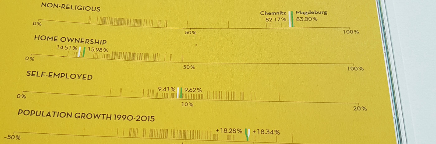
The printed strip-plots in issue #10 of the InGraphics Magazine
I created these strip-plot series using React and a few of d3’s methods. Here we are going to rewrite the visualization step by step.
Let’s get started
Usually I start off with a blank React setup using create-react-app and adding storybook. To get them running, type npm i -g create-react-app @storybook/cli in your terminal to install them globally (if you haven’t done so already.)
Then direct your terminal to your preferred coding folder (which I know lives somewhere on your desktop) and type create-react-app strip-plots. Change to the directory with cd strip-plots and install storybook by typing getstorybook. If storybook gives you an error, try typing npm install to reinstall all dependencies, this should do the trick. Test your setup by calling npm run storybook from your terminal, it should start a new storybook on a localhost (9009 by default).
In our folder structure we can see it has added a stories folder inside src with an index.js and two sample components.
In the src folder, create a new folder components and inside that, create a new file called App.js. This will be our main application file. Import it into the index.js file under stories. Also remove the example components. The file should look like this:
// ./stories/index.js
import React from 'react';
import { storiesOf } from '@kadira/storybook';
import App from '../components/App';


storiesOf('Strip Plots', module)
  .add('basic strip plot', () => (
    <App />
  ));
Let’s start building something we can actually see. We’ll start with our main canvas. In your App.js write:
// ./components/App.js
import React from 'react';

class App extends React.Component {
  render() {
    return (
      <svg
        width={800}
        height={120}
        style={
          { backgroundColor: "#E3C44D",
            stroke: "black"
          }
        }
      >
        <line x1={40} y1={80} x2={800-40} y2={80} />
      </svg>
    );
  }
}

export default App;
In your storybook, you should then see this: Admire the rad canvas and the nice, crisp line running across it. We can already imagine this to be our base axis.

Our first visual result
In our eagerness to see a result we hardcoded the positions of the line, let’s rewrite that. We will create some dimension properties for our App and use them in the render function for some more flexibility. The graphic won’t change, but our code will look better.
Update your files to the contents of this gist.
Mapping things
Now let’s see if we can map some values onto our axis. Since this is a scale from 0% to 100%, we would expect a value of 50% to appear in the middle, right?
For mapping we will use the linear scale from d3. In your terminal, type npm install d3-scale@1.0.6 --save to make d3’s scales available to us. Then change your App.js like so:

Our first strip-line sitting in the middle of the axis
We have imported the scaleLinear function from d3 and created ourselves a new scale with a value domain of 0 to 100 and a range from the left margin of the canvas to the right. Then we drew a new line using that scale with a value of 50 and indeed it gets placed in the middle of our graphic.
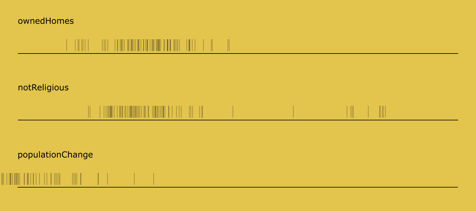
Nice! Now what about a series of values to draw? Let’s create an array with the values [0, 50, 100] and use lodash to draw a line for each of them.

The boundaries of our axis drawn from an array of values
So, what happened here? First of all, we extracted the drawing of our strip-line from the render block into its own function. It still uses our scale, the canvas dimensionsand a value to show on the scale. These will be passed in as parameters. Also, since we draw those lines in sequence now, React needs us to give it a key property. We use a numerical index as the value for that.
stripLine(scale, dimensions, value, index) {
   const {height, margin} = dimensions;

   return (
     <line
       key={index}
       x1={scale(value)}
       y1={height - margin.bottom - 4}
       x2={scale(value)}
       y2={height - margin.bottom - 24} />
   );
 }
We could then implement the function like this:
render() {
    const {width, height, margin} = this.props;
    const scale = scaleLinear()
      .domain([0, 100])
      .range([margin.left, width - margin.right]);

    const values = [0, 50, 100];
    const app = this;

    return (
      <svg
        ...
      >
        ...
        {
          _.map(values, function(value, index) {
            return app.stripLine(scale, app.props, value, index);
          })
        }
      </svg>
    );
  }
Lodash’s _.map applies a function to every value in a collection, providing the current value and a loop index. In our anonymous function above, we just pass them down to the stripLine function. Additionally, we have to create a reference to the React component and its properties with const app = this to be able to use it inside the anonymous function.
Instead, let’s use lodash’s _.curry to apply part of the stripLine function while we still have access to the component scope. We can write const createStripLine = _.curry(this.stripLine)(scale, this.props) which now only needs the value, index parameters to be fulfilled: exactly what _.map will return. We can then use it like this:
render () {
  ...
  {  _.map(values, createStripLine) }
}
Bring in the data
Seems like we are ready to map some real data onto our strip-plot. Download the data-file here and put in into the public folder of the project directory. Type install d3-request@1.0.5 --save in your terminal, then change App.js to this:

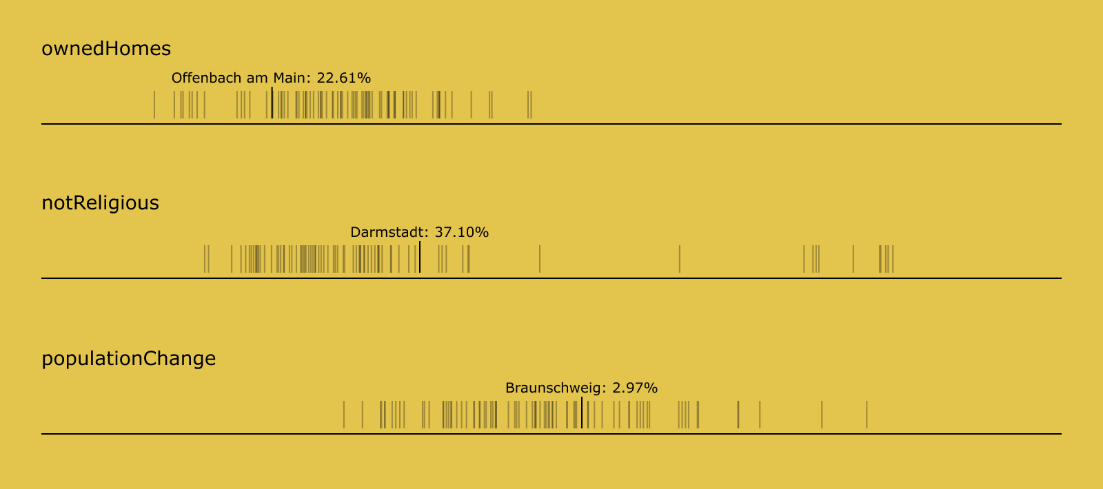
Dataset mapped onto the axis
Perfect, we can now see the distribution of home ownership in our dataset. If you opened up the console in your browser, you could also see the value for each strip when you hover it with the cursor.
Again, we hardcoded the category to display into the componentWillMount function. Let’s change that and also extract the stripLine function and make it a component of its own. In the src/components folder, create a new file StripSeries.js, then update your files to the following:
We can now print different categories of our data in their own strip-plot
Our App.js has changed a little. We have extracted the stripLine function and instead import the newly created StripSeries component. We also created mouse handlers, that will be called from StripSeries and which will change the app state, instead of printing the values to the console. You can inspect the app state using the
React Developer Tools in Chrome, for example. We will use this state in the next step to make text appear above the selected line.
We also changed the index.js to include two more categories, now that we are able to pass the category name as a property. But the “population change” seems to be a little bit off. That’s because our scales are still hardcoded to go from 0 to 100, while the values in that category range somewhere between -50 and 50. This will also be fixed in the next step.
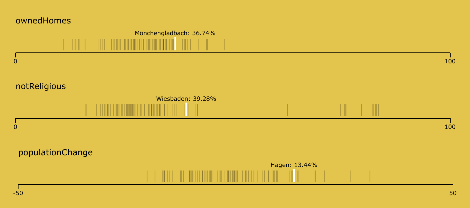
Show me the numbers
It’s time we added some text to display the selected value. Change your files like so:
A text with the according values will appear on hover
With the min and max properties, we can see the distribution now also works properly for the “population change” plot. And when we hover, the selected line now has an active style and a floating text above it, showing the information.
There are some issues left to fix. It’s kind of hard to catch a line with the cursor, since it’s only 1px wide. In the next step, we will overlay the line with a transparent rectangle to give it some more interaction area. And we will finally put labels on our axis, too. Start by creating a new Axis.js file in the src/components folder, then change your files like so:
Min and max values are shown on the new Axis component
See? We also changed the hover state to be a little more outstanding and noticable.
That’s it for this article. In part 2 we will evolve the strip-plots into a single application with a shared state, so that the current selection will be highlighted in all five categories plus showing the closest city match.
If you liked this article, spread the word and Tweet about it.