Creating a strip plot in React ‒ part 2
This is the second part on creating a strip plot in React. In Part 1 we left off with individual plots that could show the value for the selection in each category. Now we’re going to take things a little further and combine the individual plots into one application that synchronizes the selection among all plots. Plus, we are going to implement the multidemensional-distance calculation and, based on that, show the closest matching city to our selection.
A single state for all plots
This is going to be a big change that will ripple through all of our existing files. I will go through the details in a moment. For now, create a new StripPlot.js in the src/components folder and then update your files to the following:
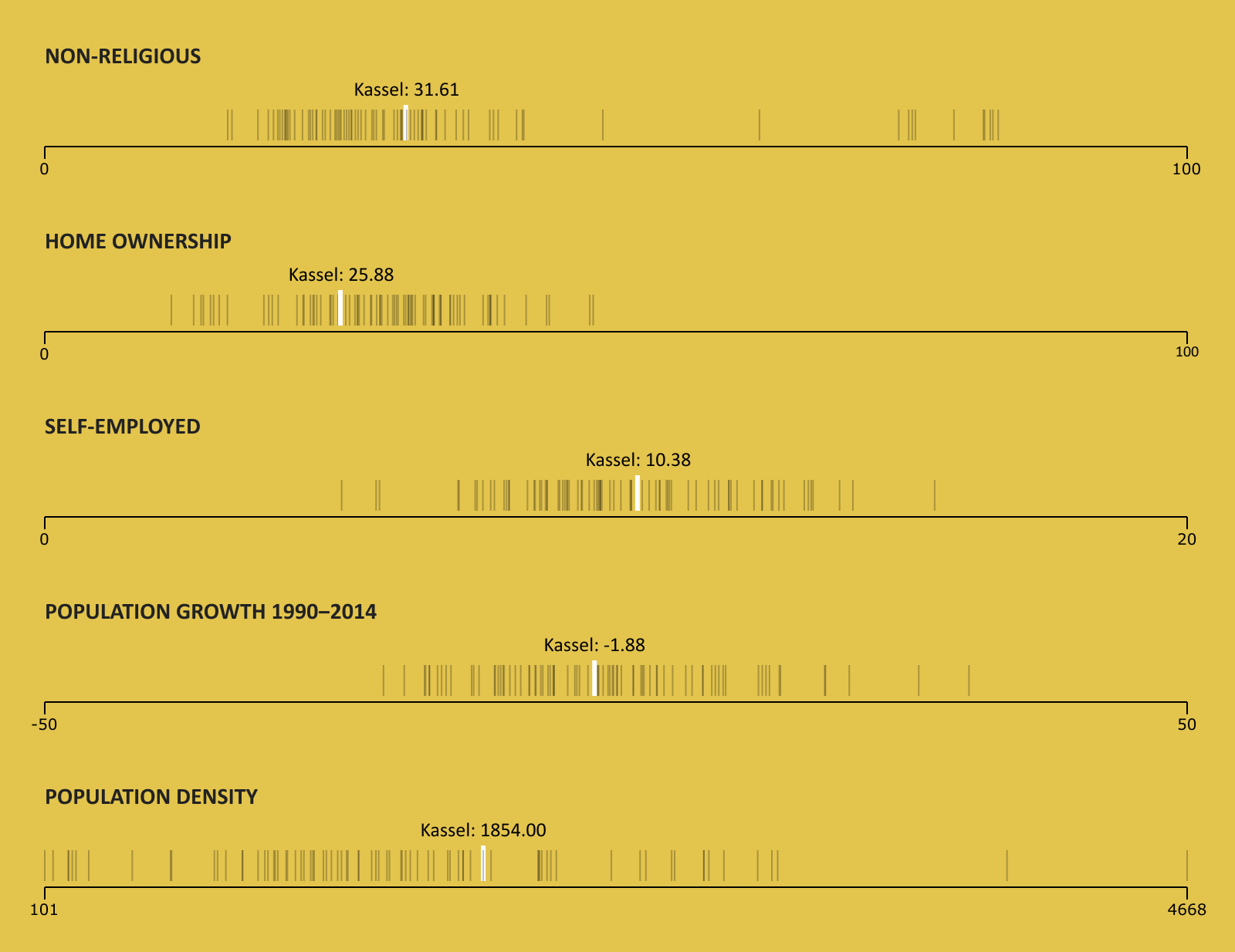
The selected value will now be highlighted in all plots
The biggest change is that we moved the rendering of Axis and StripSeries from App.js into the newly created StripPlot.js, along with the state for positioning and showing the active value of the hovering text. Instead, the only state value in App.js is now the activeCity value that will be passed to all StripPlot components.
Then, in index.js, we now only have one storybook item, which is the whole application. The individual settings for each strip plot live inside the categories settings.
In Axis.js and StripSeries.js we just renamed variable height to plotHeight and activeStrip to activeCity, to better describe their meaning.
Comparing cities by data
With this step, we will implement the comparison of cities with the multidimensional-distance calculation. I’ll explain how this is done shortly, but first create a new Util.js
inside src/components and update the following files:
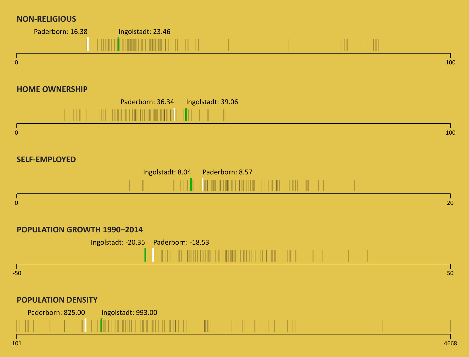
The closest matching city will be displayed next to the selection
The calculation starts by mapping the minimum and maximum values of each category to a scale from 0 to 1. This is done in the createScale function of Util.js. The category values of all cities then get mapped onto that scale. So, for example, the data representation of Berlin will look something like this:
// Berlin (rounded values)
{
  "nonReligious" : 0.69
  "ownedHomes" : 0.10
  "selfEmployed" : 1 // highest value in category "self-employed"
  "populationChange" : 0.35
  "populationDensity" : 0.84
}
The getCityMatchValue function takes the data representations of two cities and returns a total distance value by summing up the differences between the two cities in each category.
For each city, the distance to every other city is calculated and the results are then sorted. The city with the smallest value becomes the match-city.
Tidying up the graphic
Now that we have everything working the way we want, it’s time to look at our work from an aesthetic point of view. For readability, we will add a little legend above the plots. Also we want the hovering information to be stacked, with the name of the city above the number.
In addition, we will make the axis and the plot titles a little more customizable. So for the next and final step, create the new files Label.js and Legend.js inside the src/components folder and again update all your files to the content of this gist:
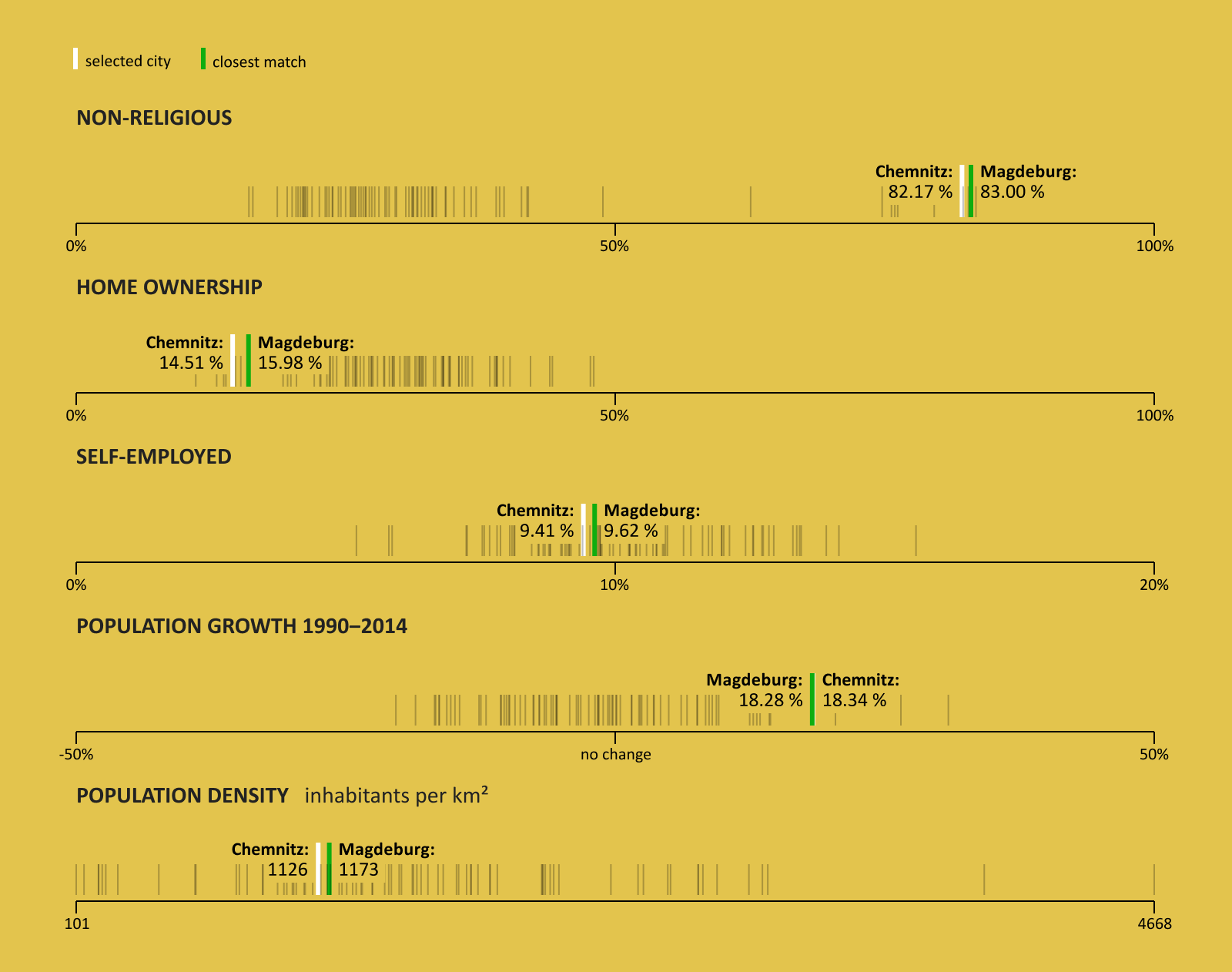
The final version of our strip-plot application
Alright. So you see we added a little more margin to the sides, giving it some more space. We also gave the last plot “Population Density” a subtitle, explaining the unit of the displayed numbers.
All of the axes except the last one now also have a tick in the middle, which can even be customized, as the axis for “Population Growth” shows.
We have come to the end of this two-part article on strip plots. We could still improve the application in many ways. First thing would be to make it responsive, since by now it only works in one fixed width. Maybe a search bar would be nice, to be able to quickly highlight a certain city. But for now, we can be proud of what we have achieved so far.
If you found this article useful and think others should read it, then maybe give it a Tweet . Thank you for reading!